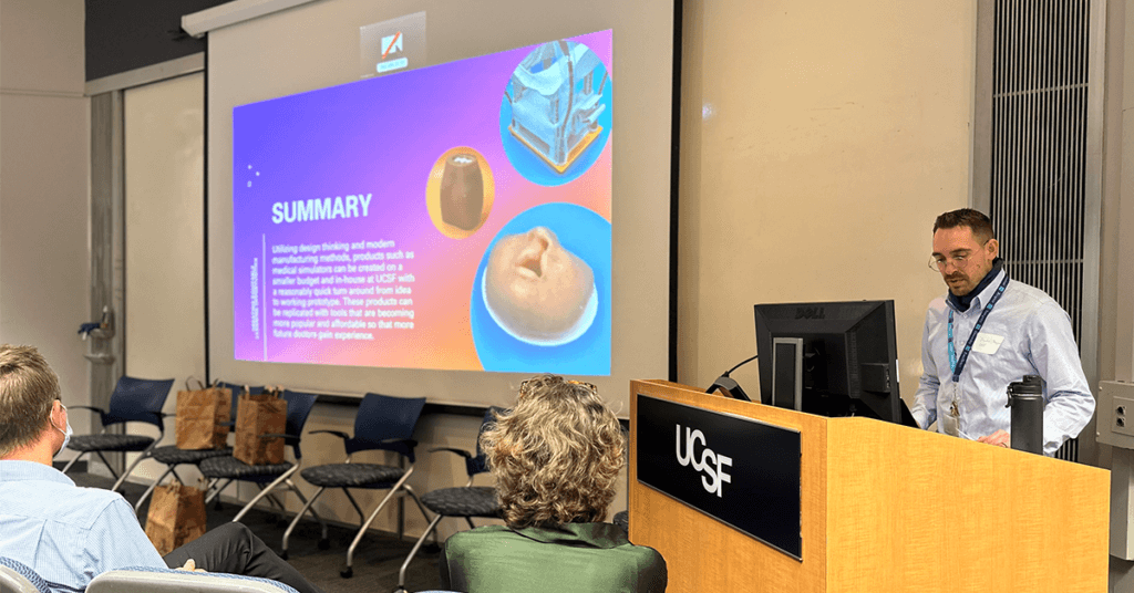
When working at a health sciences institution with a strong commitment to diversity, equity, and inclusion (DEI), it is inspiring to see how forward-thinking colleagues are in identifying and implementing best practices with the intent that all community members are being included and seen. At the UCSF Library we include DEI practices and design in our systems, initiatives, and resources. One such resource is the Anti-Racism Resource guide created and maintained by library staff. This guide is an overview of the anti-racist books and articles in the UCSF Library’s collections, and is intended to support library patron’s self-education. Attention to user experience design ensures that UCSF Library website content and digital communications are accessible to all users. It is this kind of working and learning environment that encouraged the UCSF Library Makers Lab team to assess systemic barriers that impact our makerspace.
From 2020 to 2021 the UCSF Library’s Makers Lab worked through a power analysis framework based on the chapter “From Needs Analysis to Power Analysis: A Framework to Examine & Broker Power in Makerspaces” by Brianna Marshall, director of research services at the University of California Riverside Library and Dr. Marijel (Maggie) Melo, assistant professor, from the School of Information and Library Science at the University of North Carolina at Chapel Hill. Our goal was to analyze and identify concrete action items to address systemic barriers commonly seen in tech-centric environments, such as makerspaces.
It was a challenge for our team to recognize our own inherent biases through the course of the analysis. Fortunately the open-ended questions from the framework helped us recognize ways to improve the inclusivity, equity and accessibility of our offerings. Through our discussions we analyzed what patrons see when they visit our website and makerspace. Examples of areas we have addressed are removing exclusive language from our communications, providing closed captions to make video recordings accessible, and more.
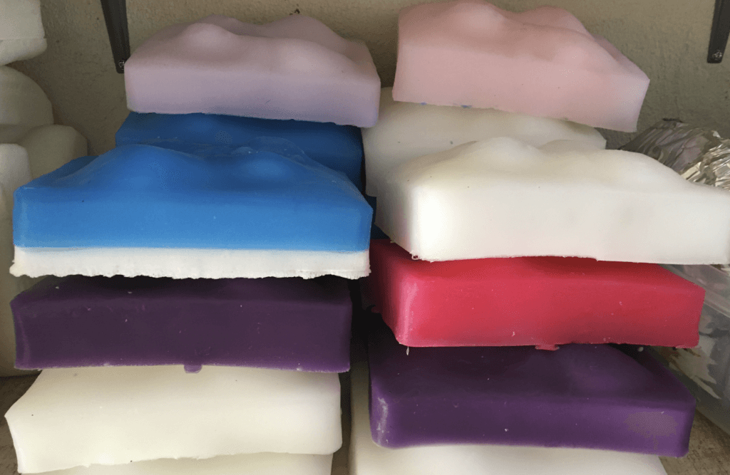
Examples of inclusive materials used by the Makers Lab
The Makers Lab empowers makers to implement diversity, equity, and inclusion practices in the products they make. An example of this is utilizing color choices that represent the range of human skin tones. Most of the synthetic “skin” we make is made of silicone. The company that manufactures the silicone pigment, Smooth-On, offers colors that reflect a wide range of tones, as shown in the following chart.
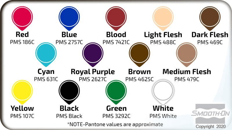
(Silc PigTM Product Information, n.d.)
UCSF School of Medicine graduate and UC Davis anesthesiology resident Jacqueline Booker, MD, shared her thoughts on the importance of diversity within simulation education materials.
Going from a student to resident, I’ve gone through the process of training in a purely simulated environment to doing procedures on patients and every time, I felt that exposure to a phantom/trainer was beneficial to learning the fundamentals of a procedure. I especially appreciate the conscious effort that you and the Makers Lab are putting into building task trainers with different skin appearances. As a person of color, it’s refreshing to see work that advances DEI in the field of simulation education. Anatomical landmarks can appear different depending on skin color and body habitus, so it follows that medical trainees should have as much variety as possible when practicing procedures. On a more general level, it also normalizes the central idea that we should provide the best possible care for ALL patients!
Jacqueline Booker, MD
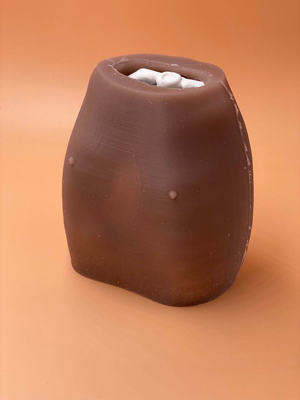
The neonatal rib cage trainer created by Beverly Shoemaker, RN, MSN, NNP, at UCSF Benioff Children’s Hospital is also an example of how different skin tones can be used to enhance a resident’s learning experience and benefit future patients.
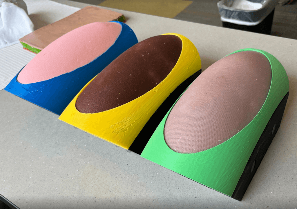
Makers Lab engineer, Jenny Tai, saw the value in creating multiple versions of a lumbar puncture trainer that represent different skin tones for the UCSF Department of Oncology and Hematology.
Aside from trying to choose complementary colors, there was no flesh color in the silicone pigment pack so I found it was a good opportunity to mix some more diverse colors than what was offered. Also, med students have mentioned they value seeing darker skin tones when they do simulation training, so I wanted to make several different skin tones for this project.
Jenny Tai
Kim Dau, CM, MS, Rebekah Kaplan, CNM, MS and Emily Beck, CNM, MS, from the UCSF School of Nursing developed custom task trainers for midwifery students to practice suturing. A variety of artificial tones were requested because these colors create opportunities for students to see features during the suture practice that they would not see with natural skin tones. It is also often considered that “having a diverse medical education environment is imperative for exposing learners to the diverse population of patients they may encounter when in practice” (Micallef et al., n.d.). The Makers Lab plans to work with faculty and students to identify a diverse range of natural skin tones for future model iterations.
In collaboration with Kelsey Ogomori, MS3 and Jordan Virbalas, MD, pediatric otolaryngologist and director of the aerodigestive clinic in Oakland, the Makers Lab helped develop multiple models of infants born with a cleft lip reflecting a range of skin tones that UCSF residents use to practice the procedure.
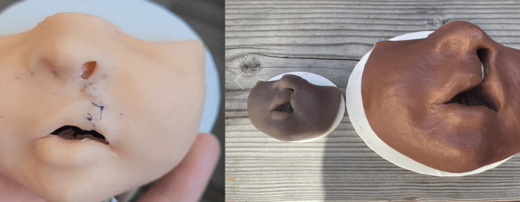
These are just a few examples of projects in the Makers Lab that have been a catalyst for addressing DEI in health science simulation. Representing a diverse patient population in our work is part of our workflow and values. Our goal is that these types of projects will have a positive effect on UCSF learners, educators, clinicians, and patients.
Considerations for inclusive design
In researching examples of DEI implementation, specifically in makerspaces, we find that service design in the form of a free tool lending library that gives all people access to tools, rather than just the people that can afford them, can “help residents in the area rehab their houses and build [financial] equity rather than being pushed out of the neighborhood by developers” (Masters, 2018). You can also see this implemented in accessibility in industrial designed products such as custom hand-grips for people who struggle to hold un-adapted tools and 3D printed graphs for visually-impaired people who can’t see a math instructor’s notes (Masters, 2018).
Antoinette D. Carroll gives an in-depth presentation on “Understanding Identity, Power, & Equity in Design Leadership” and uses the following slide, courtesy of the Robert Wood Johnson foundation. The graphic depicts equality as sameness, where everyone gets the same product whether they can use it effectively or not. At the Makers Lab we analyze whether our offerings are equitable. The goal of equity is to provide individuals shared experiences that are fair and suit individual needs and abilities.
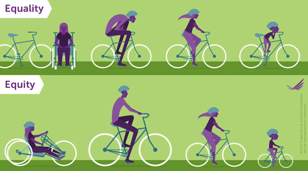
Robert M. Sellers, vice provost for equity and inclusion, chief diversity officer, Charles D. Moody Collegiate Professor of Psychology, and professor of education of the University of Michigan, describes another way to think about DEI with the following analogy: “Diversity is where everyone is invited to the party. Inclusion means that everyone gets to contribute to the playlist. Equity means that everyone has the opportunity to dance” (Defining DEI, Diversity, Equity & Inclusion, University of Michigan, n.d.). If we apply this idea of invitation, inclusivity, and equity to the equality vs. equity image above, then we can see that everyone is invited to ride a bicycle, regardless of their diverse background, and everyone is included to ride in the collective direction. However only in an equitable environment do we see everyone having a similar opportunity to experience a bike ride together.
When making products, we need to “consider the design as the way to bring change into the world and raise consciousness” (Kachan, 2021). Band-Aid’s OURTONE product is a good example of design choices that aim for inclusivity in a market that did not previously offer much variety. Associate Brand Manager of Wound Care at Johnson & Johnson, Jordan Mojka said “We agreed that as the category leader, we had a major product gap and wanted to solve for this as quickly as possible, ensuring that we better reflected the communities we serve” (The Story Behind BAND-AID® Brand OURTONETM Adhesive Bandages, 2021).
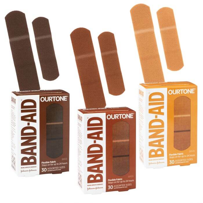
Like Band-Aid’s approach to design choices, the Makers Lab strives to break down biases in our model development so that we can bring positive change to our community.
Collaborate with us
How have you addressed diversity, equity, and inclusion in your teaching or learning? Have you considered design choices that facilitate more inclusive learning? Do you want to know how the Makers Lab can support your work? Contact us to share your ideas to continue the conversation.
