This fall the UCSF School of Pharmacy (SOP) launched a new curriculum which emphasizes collaborative problem-solving, continuous learning, and leadership in patient-centered quality improvement. The SOP Office of Education and Instructional Services (OEIS) partnered with the Learning Technology Group (LTG) to create a new CLE course template that encourages student engagement and supports online learning and collaboration activities.
The SOP Curriculum Design Workgroup was formed to foster a collaboration between both departments, to assist with instructional design, and to bring together staff with complementary skills. The team included Steven Dominguez, Breanne Ho, Gitanjali Kapur, Lisa Leiva, Kylie Leung, Sean McClelland, and Alexa Tan. SOP staff in the group had detailed knowledge of their curriculum, their needs, as well as strong CLE experience. LTG staff shared their expertise in the inner workings of the CLE, instructional design, and their experience with how the CLE is used by different programs throughout the UCSF community. The School of Pharmacy has made significant strides in reshaping how learning content is shared and delivered through the CLE. In the past few months, we’ve sought to establish a consistent learning experience for current students, while identifying new areas of restructuring for students entering the PharmD program in 2018 and beyond.
Analysis
The Work Group met weekly for 1 hour, for 6 weeks and our efforts focused on designing course templates for the Cardiovascular and Foundations I courses. We were challenged with organizing content-heavy courses that intermingle three areas of the curriculum; core and inquiry studies practice, applied patient care skills, and experiential skills.
We carefully considered the student experience and how they would engage with materials:
- It was important to design a course where students could easily find attendance links, pre-work, assignments, in-class materials, and due dates.
- Information also needed to be organized so that they could keep track of their responsibilities for each week, day, and session.
- The course would also need to be visually appealing to students but manageable for course staff.

Design and Development
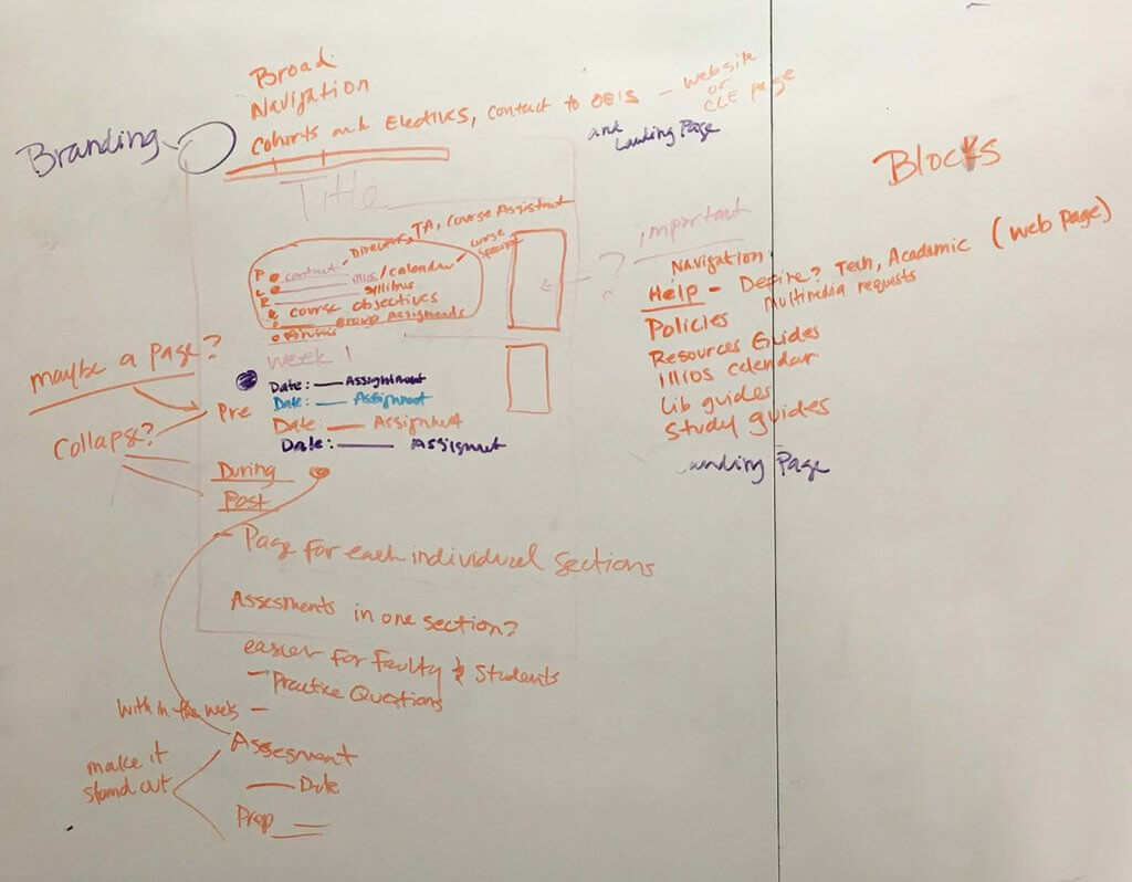
In initial meetings, we brainstormed about possible solutions for organizing course content. There were many great ideas but we focused on simplifying how students access materials. Our first task was to customize the SOP navigation menu to organize links and information.

The custom menu includes links to the 2018 curriculum, Pathways curriculum and important links for students at the top of every page. A bold and colorful banner is placed at the top of the course template which makes courses instantly recognizable for students. A course description and high priority information are also listed towards the top of the course. High priority information includes course contacts, discussion forums, syllabus, course objectives, lecture videos, and group assignments.

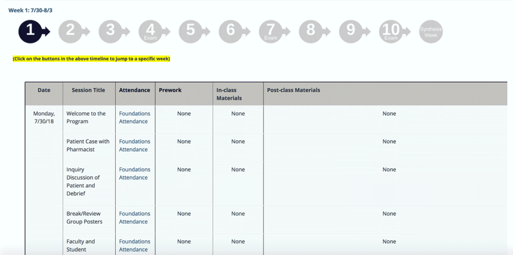
The most critical and challenging part of the design process was to organize the weekly course materials, which include session titles, links to attendance, assignments, and due dates. All materials are listed in a table to help keep students organized and to guide them through each week.
We decided to organize the course by weeks using the Collapsed topics format. This format allows students to keep course content tucked away within sections and control what they would like to display. We encountered some limitations in creating links to collapsed topics sections but we consulted with our Product Manager to help us implement workarounds. One workaround we developed is a graphic interface with numbered icons that are placed at the top of each section and link to specific weeks within the course.

Next Steps
Fresh off the start of the curriculum launch, the School of Pharmacy has been actively monitoring how students and faculty have been responding to the new CLE redesign.
The collection and evaluation of feedback from users will enable OEIS to incorporate changes to improve the learner experience and make improvements for the next phase of the 2018 curriculum – the Cardiovascular (CV) theme.
Working Together
It was a great opportunity for both groups to come together and share their expertise to design streamlined courses and improve student experiences. We learned:
- Projects like these take time more time than anyone ever anticipates so its its important to plan ahead.
- The easiest way to get started is to brainstorm, and just get all of your ideas out in the open.
- When you align good curriculum design with good instructional design, great things can happen for students!
It was very beneficial for LTG to get a closer look at the School of Pharmacy curriculum and help them meet the objectives they are trying to achieve. We hope that this will be the first of many projects that we accomplish together.

This project and blog post was a collaboration between the School of Pharmacy Office of Education and Instructional Services (OEIS) and the Learning Tech Group. Authored by Lisa Leiva and Alexa Tan, Multimedia Specialist; Office of Education and Instructional Services, UCSF School of Pharmacy
